Casa Pantuso - Curating Living Experiences
Business-driven brand repositioning through strategy and expression
Casa Pantuso — Curated Living Experiences as a Business Model
- Cliente: Casa Pantuso
-
Serviço:
Property Services
Vacation Rentals
Shared Living Economy -
Segmento:
Real Estate
Technology
Desafio
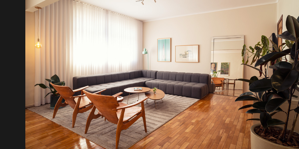
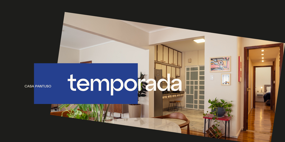
Casa Pantuso is a manager of exclusive vacation rental properties, guided by the curation of experiences that transform stays into expressions of identity, aesthetics, and lifestyle.
Operating in Belo Horizonte, the company achieved a level of operational relevance that distinguishes it from traditional short-term rental platforms, standing out through operational excellence, close relationships with clients and partners, and a rigorous curation of the properties within its portfolio. However, the brand’s institutional perception had not yet evolved to reflect the quality of the experience it delivered.
The initial diagnosis revealed a common scenario among businesses that grow with a strong operational focus: exceptional delivery paired with a brand positioning and identity perceived, even by its own founders, as falling short of the service’s excellence. A business with no intentional or consistent brand awareness.
The challenge, therefore, was not about improving delivery, but about elevating value perception and strategic positioning. Tato Brasil’s role was to transform what was already an exclusive hospitality experience into a brand with a narrative aligned to its purpose and business model.
The project was developed to connect strategy, expression, and storytelling, allowing Casa Pantuso to be perceived for what it truly is: a curator of experiences that merges aesthetics, hospitality, and cultural value. More than competing within the vacation rental market, the brand needed to establish itself as a seal of trust and understated elegance, translating experience into differentiation, perception, and legacy.
Solução
Rebranding — Strategic Business Repositioning & Brand Expression
To distance Casa Pantuso from the ecosystem of conventional vacation rental platforms, we redesigned the business positioning through the development of a new Brand Platform. This strategic structure consolidated the company’s institutional transformation, aligning its market direction with its verbal and visual expression so the brand could be perceived in accordance with the excellence of its operations and hospitality experience.
We defined the strategic positioning discourse around the concept of Curated Experiences Through the Art of Living. This positioning elevates the management of exclusive properties into a culturally rich hospitality experience, creating lasting value for both property owners and guests who appreciate culture, art, design, comfort, and exclusivity.
The brand now expresses itself through three clear voice dimensions:
Curatorial - subtle sophistication without excess;
Assuring -proactivity and transparency with partners;
Welcoming - the human hospitality that anchors the brand’s unique experience.
The Design System
The redesign of Casa Pantuso’s visual identity emerged from the same principle: not as a purely aesthetic differentiation, but as a conscious structure that accompanies, organizes, and sustains the spatial experience. Every graphic decision was designed to communicate value clearly and in alignment with the brand’s purpose.
The graphic ecosystem was built as an integrated and flexible system:
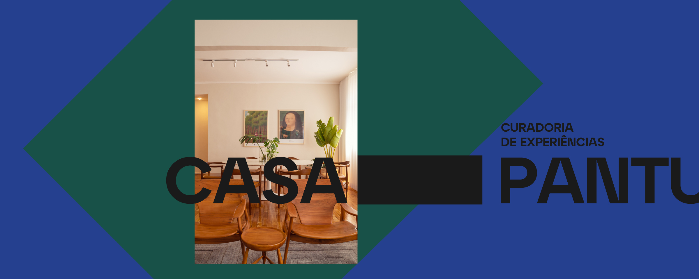
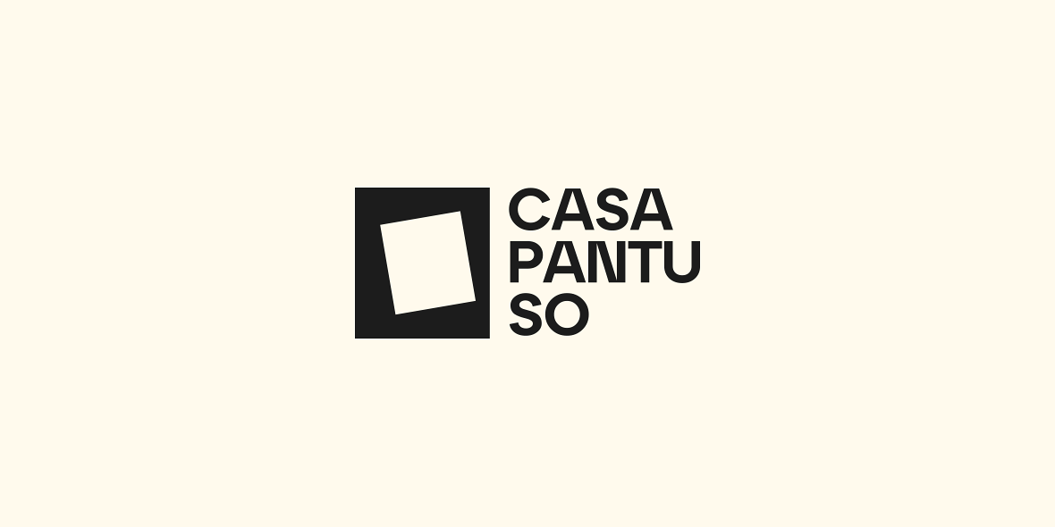
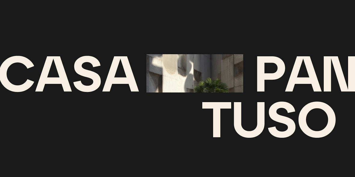
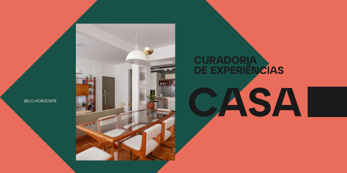
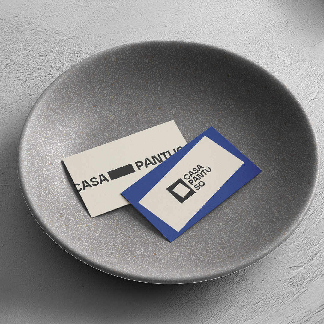
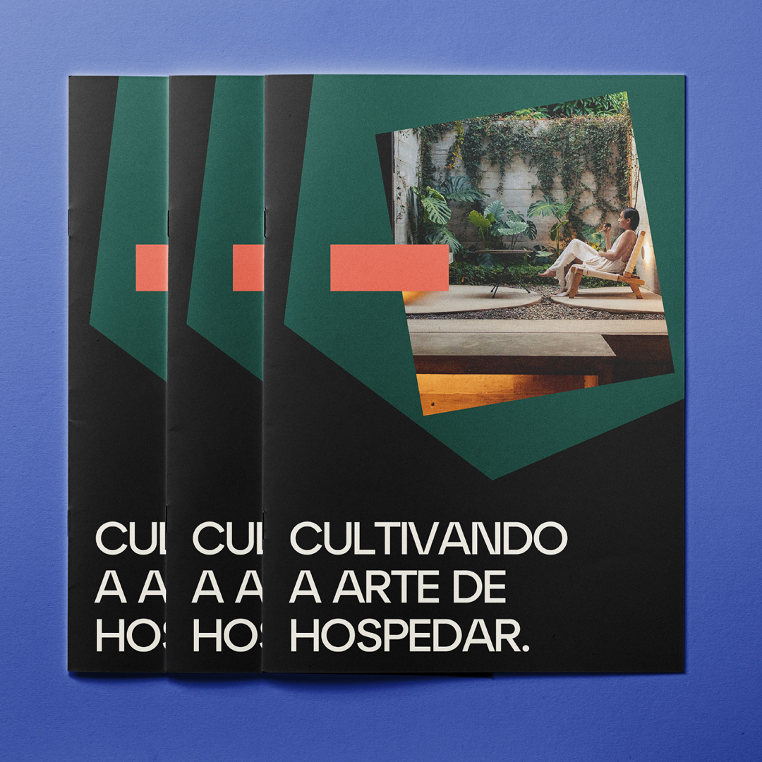
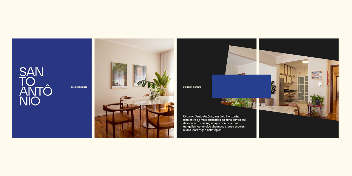
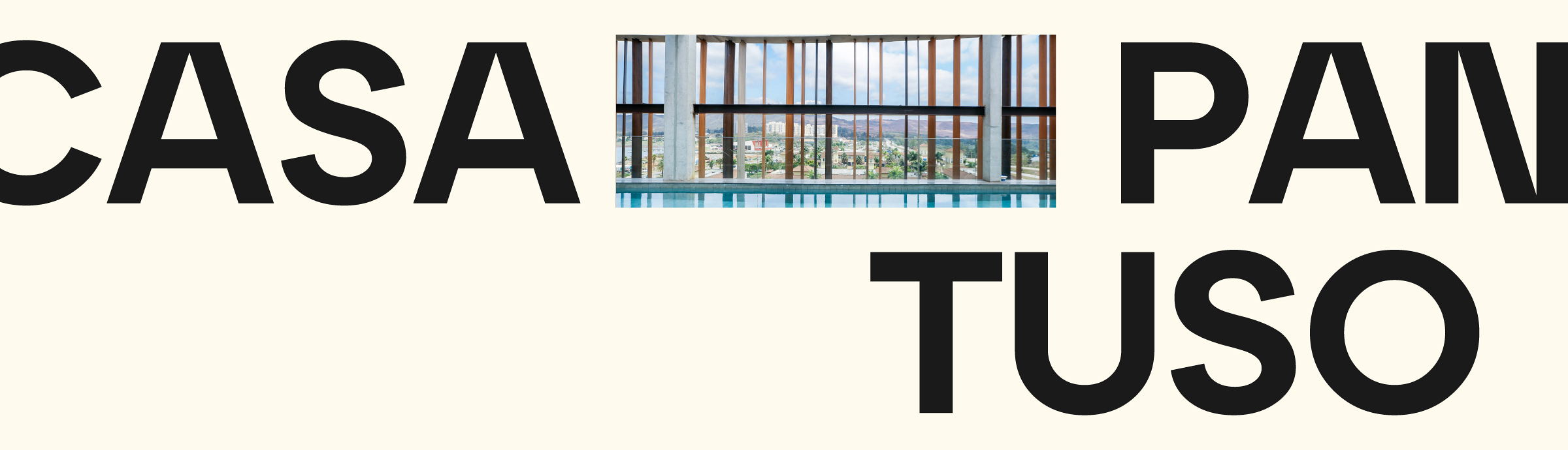
Opening Concepts: The logo and graphic language were inspired by architectural floor plans and spatial openings, windows, passages, and framing structures. These forms operate as a curation of perspective, elegantly framing content and authorial photography with sophistication and restraint.
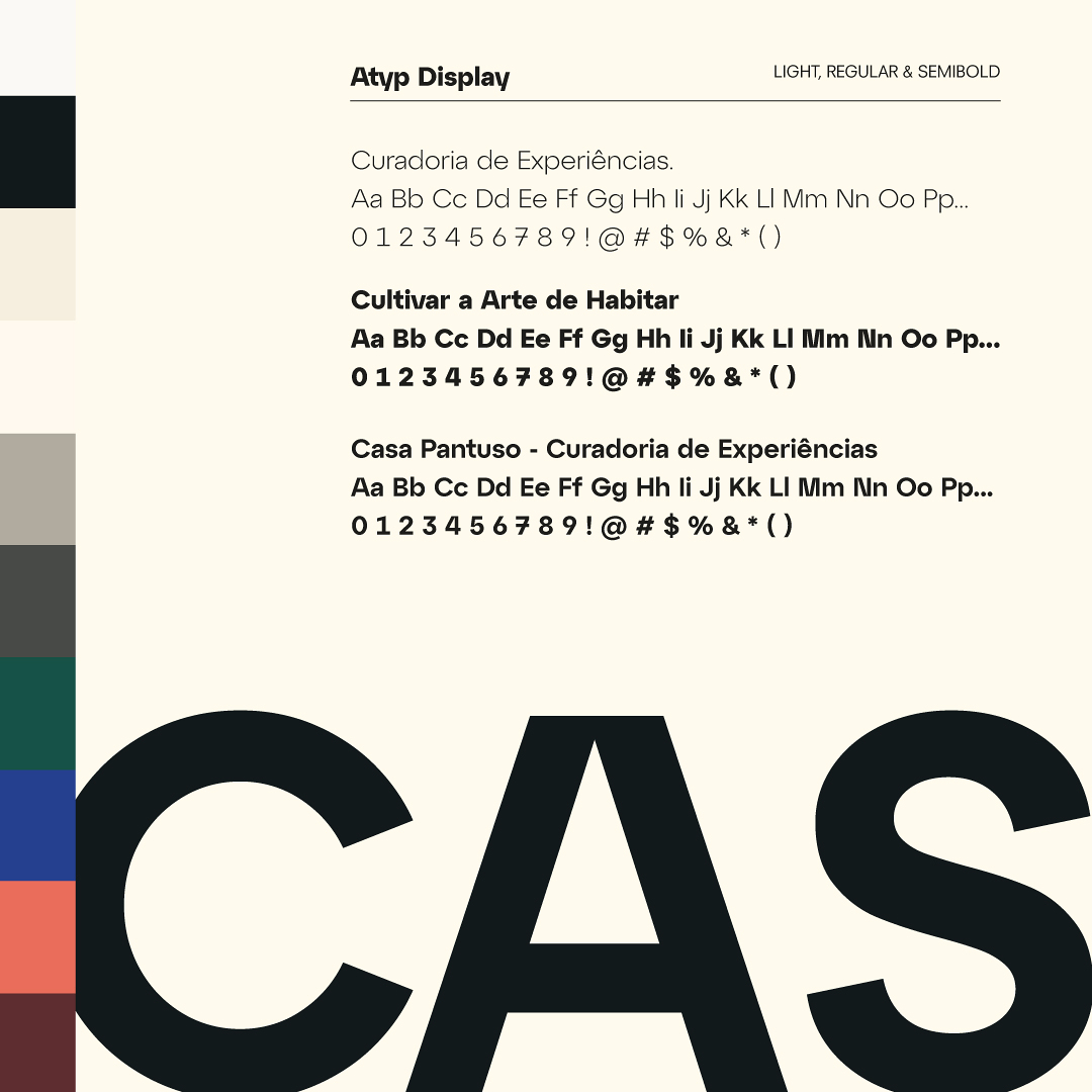
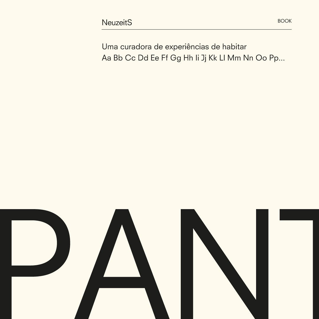
Editorial Typography: The primary typeface was selected to evoke the visual language and structural elegance of architecture and art publications, reinforcing authority and visual refinement. Supporting information and reading flow are sustained by an auxiliary type family designed for clarity and functional versatility.
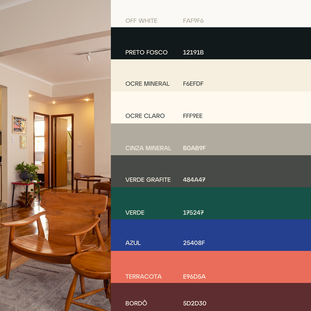
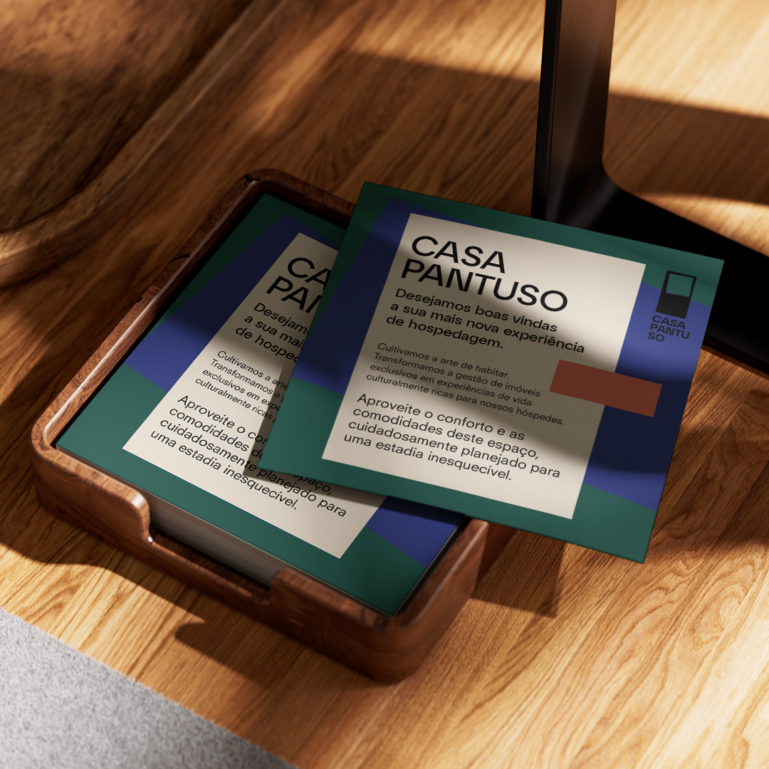
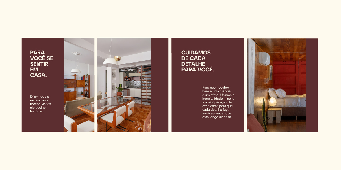
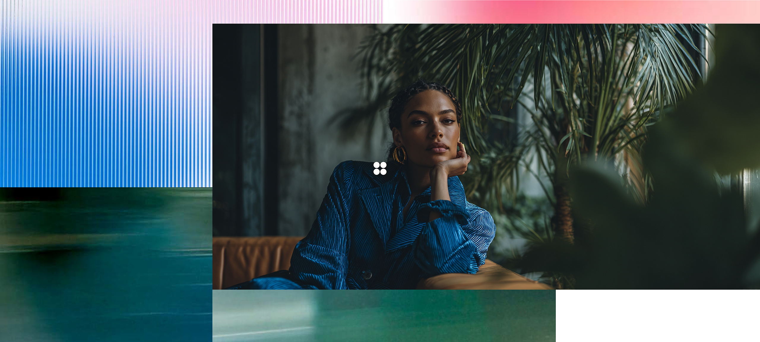
Color Palette: The institutional palette is grounded in the sobriety of off-white and matte black, bringing the communication closer to the visual rhythm of contemporary museums and galleries. Contrast and emotional energy are introduced strategically through editorial and sensorial tones, green, blue, mineral terracotta, and burgundy, primarily applied across physical hospitality materials and the brand’s digital communication dynamics.
Outcome and Impact
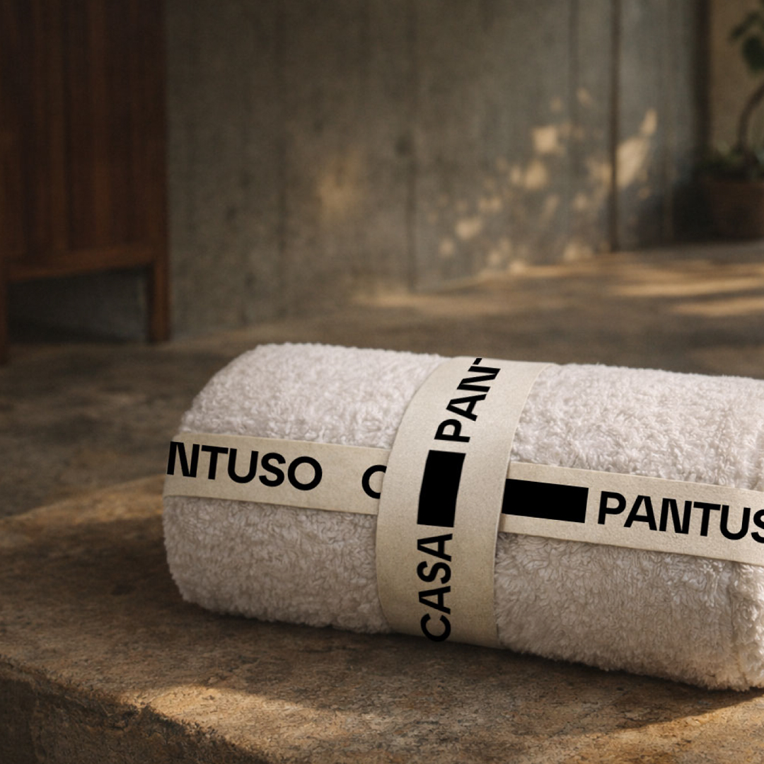
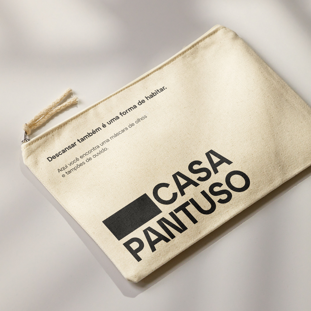
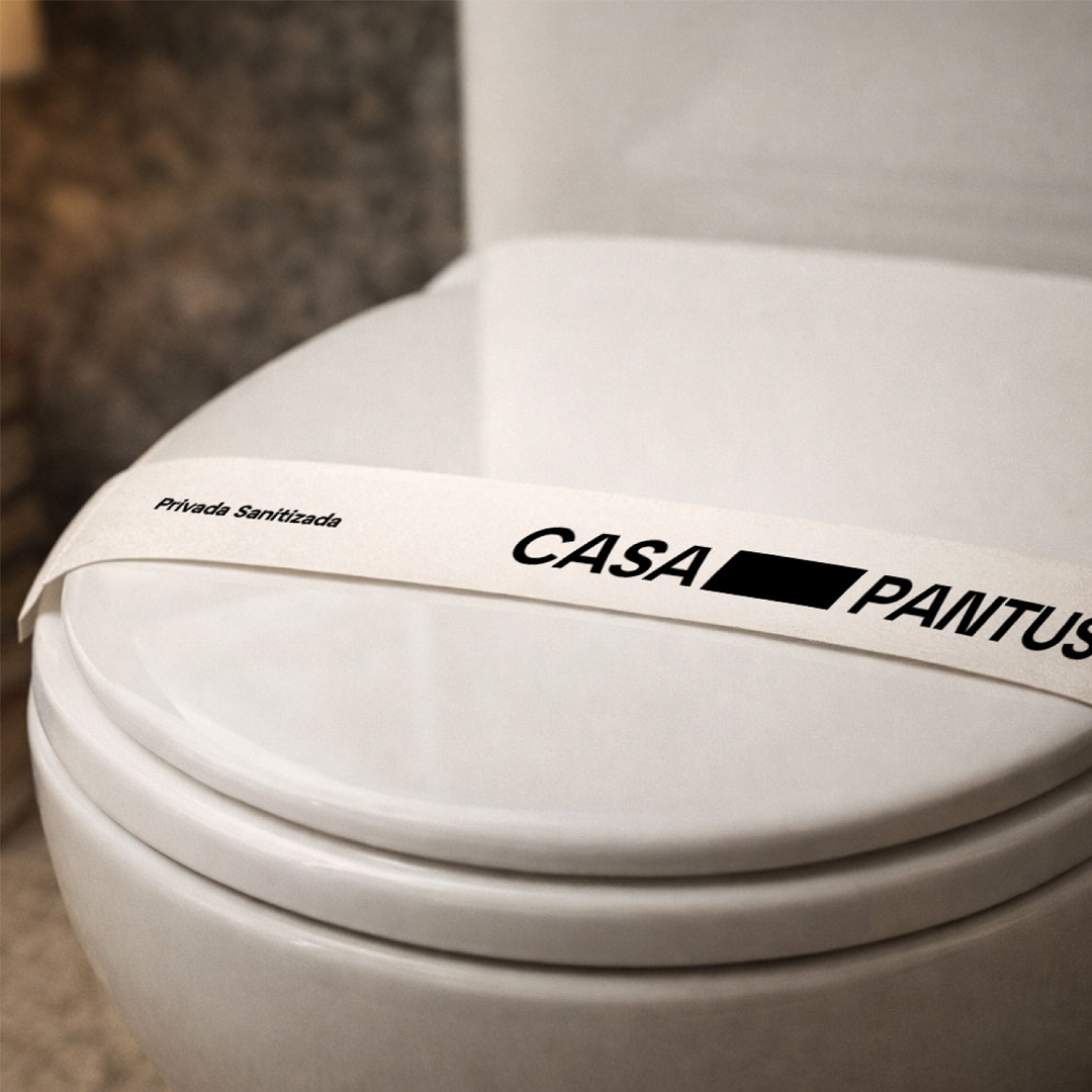
From strategy to implementation, the new visual identity was consistently applied across every touchpoint of the experience journey. From thoughtful hospitality details and in-property signage to digital presence, the new system operates as a visual translator of the brand promise.
The result is a brand that no longer competes generically within the market, but instead embraces its definitive role: a seal of understated elegance and curatorship that transforms spaces into genuine expressions of identity and lifestyle.
Casa Pantuso - A Curated Experience Through the Art of Living.